はじめに
Flutterプログラミングに慣れてきた頃に、「ちょっとオシャレなボタンやデザインにしたいな」と感じますよね。センスのある方はオリジナルの背景やボタンをデコレーションしていけるのでしょうが、僕はデザイン系の才能がなくて。
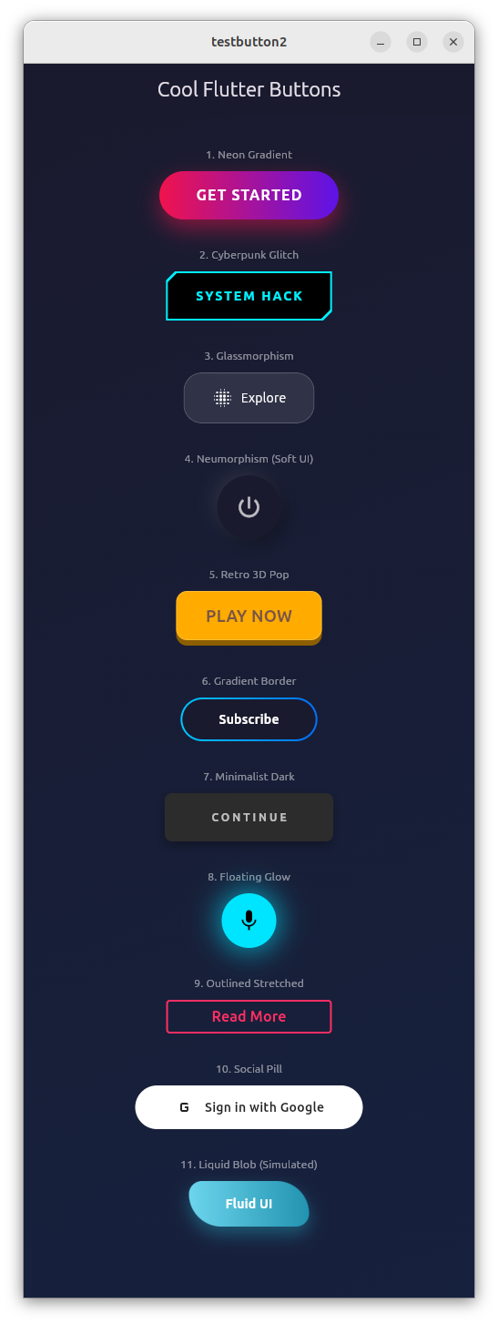
そこで、Geminiに、「かっこいいFlutter用のボタンを10個ぐらい作って」とお願いしたら、秒で作ってもらえました。
AI賢いね。
また、Geminiにネットで見つけたpythonで数独パズルを解くプログラムを示して、「このpythonプログラムをFlutterのソースにコンバートして」とお願いしたところ、GUIも含めて作ってくれました。Gemini恐るべし!
ただ、バイブプログラミングについては、僕は否定派です。細かいロジックの手順を示せば完璧にコーディングしてくれますが、ざっくり仕様を伝えるだけでは、全く使い物にならないソースになります。AIの吐き出すソースは、デバッグする気にもならないね。
結局、プログラミングが出来る人でないと、バイブプログラミングは失敗します。プログラミングスキルを磨く努力は必須ですね。
クールなボタンのサンプルソース
import 'package:flutter/material.dart';
import 'dart:ui'; // For Glassmorphism
void main() {
runApp(const MyApp());
}
class MyApp extends StatelessWidget {
const MyApp({super.key});
@override
Widget build(BuildContext context) {
return MaterialApp(
debugShowCheckedModeBanner: false,
theme: ThemeData.dark().copyWith(
scaffoldBackgroundColor: const Color(0xFF1A1A2E),
),
home: const ButtonGallery(),
);
}
}
class ButtonGallery extends StatelessWidget {
const ButtonGallery({super.key});
@override
Widget build(BuildContext context) {
return Scaffold(
appBar: AppBar(
title: const Text("Cool Flutter Buttons"),
backgroundColor: Colors.transparent,
elevation: 0,
centerTitle: true,
),
body: Container(
// 背景にグラデーションを入れてGlassmorphismなどを映えさせる
decoration: const BoxDecoration(
gradient: LinearGradient(
begin: Alignment.topLeft,
end: Alignment.bottomRight,
colors: [Color(0xFF1A1A2E), Color(0xFF16213E)],
),
),
child: ListView(
padding: const EdgeInsets.all(20),
children: [
_buildSection(
"1. Neon Gradient",
const NeonGradientButton(text: "GET STARTED"),
),
_buildSection(
"2. Cyberpunk Glitch",
const CyberpunkButton(text: "SYSTEM HACK"),
),
_buildSection(
"3. Glassmorphism",
const GlassButton(text: "Explore"),
),
_buildSection(
"4. Neumorphism (Soft UI)",
const NeumorphicButton(icon: Icons.power_settings_new),
),
_buildSection(
"5. Retro 3D Pop",
const Retro3DButton(text: "PLAY NOW"),
),
_buildSection(
"6. Gradient Border",
const GradientBorderButton(text: "Subscribe"),
),
_buildSection(
"7. Minimalist Dark",
const MinimalDarkButton(text: "Continue"),
),
_buildSection(
"8. Floating Glow",
const FloatingGlowButton(icon: Icons.mic),
),
_buildSection(
"9. Outlined Stretched",
const OutlinedStretchButton(text: "Read More"),
),
_buildSection(
"10. Social Pill",
const SocialPillButton(
text: "Sign in with Google",
icon: Icons.g_mobiledata,
),
),
_buildSection(
"11. Liquid Blob (Simulated)",
const BlobButton(text: "Fluid UI"),
),
const SizedBox(height: 50),
],
),
),
);
}
Widget _buildSection(String title, Widget button) {
return Padding(
padding: const EdgeInsets.symmetric(vertical: 15),
child: Column(
children: [
Text(
title,
style: const TextStyle(color: Colors.white54, fontSize: 12),
),
const SizedBox(height: 10),
Center(child: button),
],
),
);
}
}
// ==========================================
// 1. Neon Gradient Button
// 明るいグラデーションと強い影で浮遊感を出す
// ==========================================
class NeonGradientButton extends StatelessWidget {
final String text;
const NeonGradientButton({super.key, required this.text});
@override
Widget build(BuildContext context) {
return Container(
decoration: BoxDecoration(
borderRadius: BorderRadius.circular(30),
gradient: const LinearGradient(
colors: [Color(0xFFF0134D), Color(0xFF5D13E7)],
),
boxShadow: [
BoxShadow(
color: const Color(0xFFF0134D).withOpacity(0.5),
blurRadius: 20,
offset: const Offset(0, 10),
),
],
),
child: Material(
color: Colors.transparent,
child: InkWell(
onTap: () {},
borderRadius: BorderRadius.circular(30),
child: Padding(
padding: const EdgeInsets.symmetric(horizontal: 40, vertical: 15),
child: Text(
text,
style: const TextStyle(
color: Colors.white,
fontWeight: FontWeight.bold,
fontSize: 16,
letterSpacing: 1.2,
),
),
),
),
),
);
}
}
// ==========================================
// 2. Cyberpunk Button
// 角をクリップし、ネオンカラーの枠線をつけたテック系デザイン
// ==========================================
class CyberpunkButton extends StatelessWidget {
final String text;
const CyberpunkButton({super.key, required this.text});
@override
Widget build(BuildContext context) {
return ClipPath(
clipper: _CutCornerClipper(),
child: Container(
color: const Color(0xFF00F0FF), // Cyan
padding: const EdgeInsets.all(2), // Border width
child: ClipPath(
clipper: _CutCornerClipper(),
child: Container(
color: Colors.black,
child: Material(
color: Colors.transparent,
child: InkWell(
onTap: () {},
child: Padding(
padding: const EdgeInsets.symmetric(
horizontal: 30,
vertical: 15,
),
child: Text(
text,
style: const TextStyle(
color: Color(0xFF00F0FF),
fontWeight: FontWeight.w900,
letterSpacing: 2.0,
),
),
),
),
),
),
),
),
);
}
}
class _CutCornerClipper extends CustomClipper<Path> {
@override
Path getClip(Size size) {
final path = Path();
path.moveTo(10, 0);
path.lineTo(size.width, 0);
path.lineTo(size.width, size.height - 10);
path.lineTo(size.width - 10, size.height);
path.lineTo(0, size.height);
path.lineTo(0, 10);
path.close();
return path;
}
@override
bool shouldReclip(CustomClipper<Path> oldClipper) => false;
}
// ==========================================
// 3. Glassmorphism Button
// すりガラス効果。背景画像がある場所で最も映える
// ==========================================
class GlassButton extends StatelessWidget {
final String text;
const GlassButton({super.key, required this.text});
@override
Widget build(BuildContext context) {
return ClipRRect(
borderRadius: BorderRadius.circular(20),
child: BackdropFilter(
filter: ImageFilter.blur(sigmaX: 10, sigmaY: 10),
child: Container(
decoration: BoxDecoration(
color: Colors.white.withOpacity(0.1),
borderRadius: BorderRadius.circular(20),
border: Border.all(color: Colors.white.withOpacity(0.2)),
),
child: Material(
color: Colors.transparent,
child: InkWell(
onTap: () {},
child: Padding(
padding: const EdgeInsets.symmetric(
horizontal: 30,
vertical: 15,
),
child: Row(
mainAxisSize: MainAxisSize.min,
children: [
const Icon(Icons.blur_on, color: Colors.white),
const SizedBox(width: 8),
Text(text, style: const TextStyle(color: Colors.white)),
],
),
),
),
),
),
),
);
}
}
// ==========================================
// 4. Neumorphism Button
// 凹凸で表現するソフトなデザイン
// ==========================================
class NeumorphicButton extends StatefulWidget {
final IconData icon;
const NeumorphicButton({super.key, required this.icon});
@override
State<NeumorphicButton> createState() => _NeumorphicButtonState();
}
class _NeumorphicButtonState extends State<NeumorphicButton> {
bool _isPressed = false;
@override
Widget build(BuildContext context) {
const color = Color(0xFF1A1A2E); // Background color match
return GestureDetector(
onTapDown: (_) => setState(() => _isPressed = true),
onTapUp: (_) => setState(() => _isPressed = false),
onTapCancel: () => setState(() => _isPressed = false),
child: AnimatedContainer(
duration: const Duration(milliseconds: 100),
padding: const EdgeInsets.all(20),
decoration: BoxDecoration(
color: color,
shape: BoxShape.circle,
boxShadow: _isPressed
? [] // No shadow when pressed (flat)
: [
BoxShadow(
color: Colors.black.withOpacity(0.5),
offset: const Offset(4, 4),
blurRadius: 15,
),
BoxShadow(
color: Colors.white.withOpacity(0.1),
offset: const Offset(-4, -4),
blurRadius: 15,
),
],
),
child: Icon(widget.icon, color: Colors.white70, size: 30),
),
);
}
}
// ==========================================
// 5. Retro 3D Pop Button
// ゲームのような立体感。押すと沈む。
// ==========================================
class Retro3DButton extends StatefulWidget {
final String text;
const Retro3DButton({super.key, required this.text});
@override
State<Retro3DButton> createState() => _Retro3DButtonState();
}
class _Retro3DButtonState extends State<Retro3DButton> {
bool _isPressed = false;
@override
Widget build(BuildContext context) {
return GestureDetector(
onTapDown: (_) => setState(() => _isPressed = true),
onTapUp: (_) => setState(() => _isPressed = false),
onTapCancel: () => setState(() => _isPressed = false),
child: SizedBox(
height: 60,
width: 160,
child: Stack(
children: [
// Bottom Layer (Shadow/Side)
Positioned(
bottom: 0,
left: 0,
right: 0,
top: _isPressed ? 0 : 6, // Moves top down
child: Container(
decoration: BoxDecoration(
color: const Color(0xFF8B5E00),
borderRadius: BorderRadius.circular(12),
),
),
),
// Top Layer (Face)
AnimatedPositioned(
duration: const Duration(milliseconds: 50),
bottom: _isPressed ? 0 : 6,
left: 0,
right: 0,
top: _isPressed ? 6 : 0,
child: Container(
decoration: BoxDecoration(
color: const Color(0xFFFFAB00),
borderRadius: BorderRadius.circular(12),
border: Border.all(color: Colors.white.withOpacity(0.2)),
),
child: Center(
child: Text(
widget.text,
style: const TextStyle(
color: Colors.brown,
fontWeight: FontWeight.bold,
fontSize: 18,
),
),
),
),
),
],
),
),
);
}
}
// ==========================================
// 6. Gradient Border Button
// 中抜きでボーダーだけがグラデーション
// ==========================================
class GradientBorderButton extends StatelessWidget {
final String text;
const GradientBorderButton({super.key, required this.text});
@override
Widget build(BuildContext context) {
return Container(
decoration: BoxDecoration(
borderRadius: BorderRadius.circular(50),
gradient: const LinearGradient(
colors: [Color(0xFF00C6FF), Color(0xFF0072FF)],
),
),
padding: const EdgeInsets.all(2), // Border width
child: Container(
decoration: BoxDecoration(
color: const Color(0xFF1A1A2E), // Match background
borderRadius: BorderRadius.circular(50),
),
child: Material(
color: Colors.transparent,
child: InkWell(
onTap: () {},
borderRadius: BorderRadius.circular(50),
child: Padding(
padding: const EdgeInsets.symmetric(horizontal: 40, vertical: 12),
child: Text(
text,
style: const TextStyle(
color: Colors.white,
fontWeight: FontWeight.w600,
),
),
),
),
),
),
);
}
}
// ==========================================
// 7. Minimalist Dark Button
// マットな質感で落ち着いた高級感
// ==========================================
class MinimalDarkButton extends StatelessWidget {
final String text;
const MinimalDarkButton({super.key, required this.text});
@override
Widget build(BuildContext context) {
return Container(
decoration: BoxDecoration(
color: const Color(0xFF2C2C2C),
borderRadius: BorderRadius.circular(8),
boxShadow: [
BoxShadow(
color: Colors.black.withOpacity(0.3),
blurRadius: 10,
offset: const Offset(0, 5),
),
],
),
child: Material(
color: Colors.transparent,
child: InkWell(
onTap: () {},
borderRadius: BorderRadius.circular(8),
child: Padding(
padding: const EdgeInsets.symmetric(horizontal: 50, vertical: 18),
child: Text(
text.toUpperCase(),
style: const TextStyle(
color: Colors.white70,
letterSpacing: 3,
fontSize: 12,
fontWeight: FontWeight.bold,
),
),
),
),
),
);
}
}
// ==========================================
// 8. Floating Glow Button
// アイコン周りがぼんやり光るFABスタイル
// ==========================================
class FloatingGlowButton extends StatelessWidget {
final IconData icon;
const FloatingGlowButton({super.key, required this.icon});
@override
Widget build(BuildContext context) {
return Container(
width: 60,
height: 60,
decoration: BoxDecoration(
shape: BoxShape.circle,
color: const Color(0xFF00E5FF),
boxShadow: [
BoxShadow(
color: const Color(0xFF00E5FF).withOpacity(0.6),
blurRadius: 25,
spreadRadius: 5,
),
],
),
child: Material(
color: Colors.transparent,
child: InkWell(
customBorder: const CircleBorder(),
onTap: () {},
child: Icon(icon, color: Colors.black, size: 28),
),
),
);
}
}
// ==========================================
// 9. Outlined Stretch Button
// シンプルだが、幅広でタップしやすいアウトライン
// ==========================================
class OutlinedStretchButton extends StatelessWidget {
final String text;
const OutlinedStretchButton({super.key, required this.text});
@override
Widget build(BuildContext context) {
return OutlinedButton(
onPressed: () {},
style: OutlinedButton.styleFrom(
foregroundColor: const Color(0xFFFF2E63),
side: const BorderSide(color: Color(0xFFFF2E63), width: 2),
padding: const EdgeInsets.symmetric(horizontal: 50, vertical: 15),
shape: RoundedRectangleBorder(borderRadius: BorderRadius.circular(4)),
),
child: Text(
text,
style: const TextStyle(fontWeight: FontWeight.bold, fontSize: 16),
),
);
}
}
// ==========================================
// 10. Social Pill Button
// ログイン画面などで使える、モダンなピル型
// ==========================================
class SocialPillButton extends StatelessWidget {
final String text;
final IconData icon;
const SocialPillButton({super.key, required this.text, required this.icon});
@override
Widget build(BuildContext context) {
return Container(
width: 250,
decoration: BoxDecoration(
color: Colors.white,
borderRadius: BorderRadius.circular(50),
),
child: Material(
color: Colors.transparent,
child: InkWell(
onTap: () {},
borderRadius: BorderRadius.circular(50),
child: Padding(
padding: const EdgeInsets.symmetric(vertical: 12),
child: Row(
mainAxisAlignment: MainAxisAlignment.center,
children: [
Icon(icon, color: Colors.black87),
const SizedBox(width: 10),
Text(
text,
style: const TextStyle(
color: Colors.black87,
fontWeight: FontWeight.w600,
),
),
],
),
),
),
),
);
}
}
// ==========================================
// 11. Blob Button (Organic)
// 有機的な形(角丸の半径を不均一にする)
// ==========================================
class BlobButton extends StatelessWidget {
final String text;
const BlobButton({super.key, required this.text});
@override
Widget build(BuildContext context) {
return Container(
decoration: BoxDecoration(
gradient: const LinearGradient(
colors: [Color(0xFF6dd5ed), Color(0xFF2193b0)],
),
borderRadius: const BorderRadius.only(
topLeft: Radius.circular(20),
topRight: Radius.circular(50),
bottomLeft: Radius.circular(50),
bottomRight: Radius.circular(20),
),
boxShadow: [
BoxShadow(
color: const Color(0xFF2193b0).withOpacity(0.5),
blurRadius: 15,
offset: const Offset(0, 8),
),
],
),
child: Material(
color: Colors.transparent,
child: InkWell(
onTap: () {},
borderRadius: const BorderRadius.only(
topLeft: Radius.circular(20),
topRight: Radius.circular(50),
bottomLeft: Radius.circular(50),
bottomRight: Radius.circular(20),
),
child: Padding(
padding: const EdgeInsets.symmetric(horizontal: 40, vertical: 15),
child: Text(
text,
style: const TextStyle(
color: Colors.white,
fontWeight: FontWeight.bold,
),
),
),
),
),
);
}
}
//### 使い方のヒント
//1. **カラーパレット:**
//多くのデザインで「暗い背景(Dark Mode)」を想定しています。もし白い背景で使う場合は、`Colors.white` を `Colors.black` にしたり、影(Shadow)の色を調整してください(白背景なら黒い影、黒背景なら光る影)。
//2. **インタラクション:**
//`InkWell` や `GestureDetector` をラップしているので、`onTap` プロパティに任意の関数を入れるだけで動作します。
//3. **アイコン:**
//`Icons.xxx` の部分は、プロジェクトに合わせて `SvgPicture` (flutter_svgパッケージ) などに差し替えると、よりプロフェッショナルに見えます。
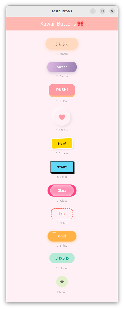
かわいいボタンのサンプルソース
import 'package:flutter/material.dart';
import 'dart:ui'; // For Glassmorphism

void main() {
  runApp(const KawaiiApp());
}

class KawaiiApp extends StatelessWidget {
  const KawaiiApp({super.key});

  @override
  Widget build(BuildContext context) {
    return MaterialApp(
      debugShowCheckedModeBanner: false,
      theme: ThemeData(useMaterial3: true, fontFamily: 'Mplus1p'),
      home: const ButtonGalleryPage(),
    );
  }
}

class ButtonGalleryPage extends StatelessWidget {
  const ButtonGalleryPage({super.key});

  @override
  Widget build(BuildContext context) {
    return Scaffold(
      backgroundColor: const Color(0xFFFFF0F5), // Lavender Blush
      appBar: AppBar(
        title: const Text('Kawaii Buttons 🎀'),
        centerTitle: true,
        backgroundColor: const Color(0xFFFFB7B2),
        foregroundColor: Colors.white,
      ),
      body: ListView(
        padding: const EdgeInsets.symmetric(horizontal: 40, vertical: 30),
        children: [
          // 1. Mochi (Standard Bounce)
          _buildRow(
            "1. Mochi",
            BouncyWrapper(
              onTap: () => print("Mochi Pressed"),
              child: const MochiButton(text: "ぷにぷに"),
            ),
          ),

          // 2. Candy
          _buildRow(
            "2. Candy",
            BouncyWrapper(
              onTap: () => print("Candy Pressed"),
              child: const CandyButton(text: "Sweet"),
            ),
          ),

          // 3. 3D Pop (内部でアニメーションを持っていますが、さらにバウンスさせます)
          _buildRow(
            "3. 3D Pop",
            Pop3DButton(
              text: "PUSH!",
              color: const Color(0xFFFF9AA2),
              onTap: () {},
            ),
          ),

          // 4. Soft UI
          _buildRow(
            "4. Soft UI",
            BouncyWrapper(
              onTap: () => print("Soft Pressed"),
              child: const NeumorphicContent(icon: Icons.favorite),
            ),
          ),

          // 5. Sticker
          _buildRow(
            "5. Sticker",
            BouncyWrapper(
              onTap: () => print("Sticker Pressed"),
              child: const StickerButton(text: "New!"),
            ),
          ),

          // 6. Pixel
          _buildRow(
            "6. Pixel",
            BouncyWrapper(
              onTap: () => print("Pixel Pressed"),
              child: const PixelButton(text: "START"),
            ),
          ),

          // 7. Glass
          _buildRow(
            "7. Glass",
            Stack(
              alignment: Alignment.center,
              children: [
                Container(
                  height: 50,
                  width: 120,
                  decoration: BoxDecoration(
                    color: Colors.pinkAccent,
                    borderRadius: BorderRadius.circular(25),
                  ),
                ),
                BouncyWrapper(
                  onTap: () => print("Glass Pressed"),
                  child: const GlassButton(text: "Glass"),
                ),
              ],
            ),
          ),

          // 8. Stitch
          _buildRow(
            "8. Stitch",
            BouncyWrapper(
              onTap: () => print("Stitch Pressed"),
              child: const StitchButton(text: "Skip"),
            ),
          ),

          // 9. Shiny
          _buildRow(
            "9. Shiny",
            BouncyWrapper(
              onTap: () => print("Shiny Pressed"),
              child: const ShinyButton(text: "Gold"),
            ),
          ),

          // 10. Float
          _buildRow(
            "10. Float",
            FloatingAnimationWrapper(
              child: BouncyWrapper(
                onTap: () => print("Float Pressed"),
                child: Container(
                  padding: const EdgeInsets.symmetric(
                    horizontal: 24,
                    vertical: 12,
                  ),
                  decoration: BoxDecoration(
                    color: const Color(0xFFB5EAD7),
                    borderRadius: BorderRadius.circular(30),
                  ),
                  child: const Text(
                    "ふわふわ",
                    style: TextStyle(
                      color: Colors.teal,
                      fontWeight: FontWeight.bold,
                    ),
                  ),
                ),
              ),
            ),
          ),

          // 11. Icon
          _buildRow(
            "11. Icon",
            BouncyWrapper(
              onTap: () => print("Icon Pressed"),
              child: const PastelIconContent(
                icon: Icons.star_rounded,
                color: Color(0xFFE2F0CB),
              ),
            ),
          ),

          const SizedBox(height: 50),
        ],
      ),
    );
  }

  Widget _buildRow(String title, Widget button) {
    return Padding(
      padding: const EdgeInsets.only(bottom: 24),
      child: Column(
        children: [
          button,
          const SizedBox(height: 8),
          Text(title, style: const TextStyle(color: Colors.grey, fontSize: 12)),
        ],
      ),
    );
  }
}

// ==========================================
//  ✨ アニメーション用の共通ラッパー ✨
// ==========================================
class BouncyWrapper extends StatefulWidget {
  final Widget child;
  final VoidCallback onTap;

  const BouncyWrapper({super.key, required this.child, required this.onTap});

  @override
  State<BouncyWrapper> createState() => _BouncyWrapperState();
}

class _BouncyWrapperState extends State<BouncyWrapper>
    with SingleTickerProviderStateMixin {
  late AnimationController _controller;
  late Animation<double> _scaleAnimation;

  @override
  void initState() {
    super.initState();
    _controller =
        AnimationController(
          vsync: this,
          duration: const Duration(milliseconds: 100), // アニメーションの速さ
          lowerBound: 0.0,
          upperBound: 0.1, // 縮小率 (1.0 - 0.1 = 0.9まで縮む)
        )..addListener(() {
          setState(() {});
        });
  }

  @override
  void dispose() {
    _controller.dispose();
    super.dispose();
  }

  void _onTapDown(TapDownDetails details) {
    _controller.forward();
  }

  void _onTapUp(TapUpDetails details) {
    _controller.reverse();
    widget.onTap();
  }

  void _onTapCancel() {
    _controller.reverse();
  }

  @override
  Widget build(BuildContext context) {
    final scale = 1.0 - _controller.value;

    return GestureDetector(
      onTapDown: _onTapDown,
      onTapUp: _onTapUp,
      onTapCancel: _onTapCancel,
      child: Transform.scale(scale: scale, child: widget.child),
    );
  }
}

// --- 以下、各ボタンのデザイン ---

// 1. Mochi
class MochiButton extends StatelessWidget {
  final String text;
  const MochiButton({super.key, required this.text});

  @override
  Widget build(BuildContext context) {
    return Container(
      padding: const EdgeInsets.symmetric(horizontal: 40, vertical: 15),
      decoration: BoxDecoration(
        color: const Color(0xFFFFDAC1),
        borderRadius: BorderRadius.circular(50),
        boxShadow: [
          BoxShadow(
            color: const Color(0xFFFFDAC1).withOpacity(0.8),
            blurRadius: 10,
            offset: const Offset(0, 4),
          ),
        ],
      ),
      child: Text(
        text,
        style: const TextStyle(
          fontWeight: FontWeight.bold,
          color: Color(0xFF8B5E3C),
        ),
      ),
    );
  }
}

// 2. Candy
class CandyButton extends StatelessWidget {
  final String text;
  const CandyButton({super.key, required this.text});

  @override
  Widget build(BuildContext context) {
    return Container(
      padding: const EdgeInsets.symmetric(horizontal: 40, vertical: 12),
      decoration: BoxDecoration(
        gradient: const LinearGradient(
          colors: [Color(0xFFE0BBE4), Color(0xFF957DAD)],
          begin: Alignment.topLeft,
          end: Alignment.bottomRight,
        ),
        borderRadius: BorderRadius.circular(20),
        boxShadow: [
          BoxShadow(
            color: const Color(0xFF957DAD).withOpacity(0.4),
            blurRadius: 10,
            offset: const Offset(0, 4),
          ),
        ],
      ),
      child: Text(
        text,
        style: const TextStyle(
          color: Colors.white,
          fontWeight: FontWeight.bold,
        ),
      ),
    );
  }
}

// 3. 3D Pop (独自の動きを持たせるためWrapperを使わないパターン)
class Pop3DButton extends StatefulWidget {
  final String text;
  final Color color;
  final VoidCallback onTap;
  const Pop3DButton({
    super.key,
    required this.text,
    required this.color,
    required this.onTap,
  });

  @override
  State<Pop3DButton> createState() => _Pop3DButtonState();
}

class _Pop3DButtonState extends State<Pop3DButton> {
  bool _isPressed = false;

  @override
  Widget build(BuildContext context) {
    final double shadowHeight = 6.0;

    return GestureDetector(
      onTapDown: (_) => setState(() => _isPressed = true),
      onTapUp: (_) {
        setState(() => _isPressed = false);
        widget.onTap();
      },
      onTapCancel: () => setState(() => _isPressed = false),
      child: AnimatedContainer(
        duration: const Duration(milliseconds: 50),
        margin: EdgeInsets.only(
          top: _isPressed ? shadowHeight : 0,
          bottom: _isPressed ? 0 : shadowHeight,
        ),
        padding: const EdgeInsets.symmetric(horizontal: 30, vertical: 12),
        decoration: BoxDecoration(
          color: widget.color,
          borderRadius: BorderRadius.circular(15),
          boxShadow: _isPressed
              ? []
              : [
                  BoxShadow(
                    color: widget.color.withOpacity(0.6).withBlue(50),
                    offset: Offset(0, shadowHeight),
                    blurRadius: 0,
                  ),
                ],
        ),
        child: Text(
          widget.text,
          style: const TextStyle(
            color: Colors.white,
            fontWeight: FontWeight.w900,
            fontSize: 16,
          ),
        ),
      ),
    );
  }
}

// 4. Neumorphic Content (Wrapperの中身)
class NeumorphicContent extends StatelessWidget {
  final IconData icon;
  const NeumorphicContent({super.key, required this.icon});

  @override
  Widget build(BuildContext context) {
    return Container(
      padding: const EdgeInsets.all(20),
      decoration: BoxDecoration(
        color: const Color(0xFFFFF0F5),
        shape: BoxShape.circle,
        boxShadow: [
          const BoxShadow(
            color: Colors.white,
            offset: Offset(-4, -4),
            blurRadius: 10,
          ),
          BoxShadow(
            color: Colors.grey.withOpacity(0.3),
            offset: const Offset(4, 4),
            blurRadius: 10,
          ),
        ],
      ),
      child: Icon(icon, color: const Color(0xFFFF9AA2), size: 30),
    );
  }
}

// 5. Sticker
class StickerButton extends StatelessWidget {
  final String text;
  const StickerButton({super.key, required this.text});

  @override
  Widget build(BuildContext context) {
    return Transform.rotate(
      angle: -0.05,
      child: Container(
        padding: const EdgeInsets.symmetric(horizontal: 24, vertical: 10),
        decoration: BoxDecoration(
          color: const Color(0xFFFFD700),
          borderRadius: BorderRadius.circular(8),
          border: Border.all(color: Colors.white, width: 4),
          boxShadow: [
            BoxShadow(
              color: Colors.black.withOpacity(0.1),
              blurRadius: 4,
              offset: const Offset(2, 2),
            ),
          ],
        ),
        child: Text(
          text,
          style: const TextStyle(
            color: Colors.black87,
            fontWeight: FontWeight.bold,
          ),
        ),
      ),
    );
  }
}

// 6. Pixel
class PixelButton extends StatelessWidget {
  final String text;
  const PixelButton({super.key, required this.text});

  @override
  Widget build(BuildContext context) {
    return Container(
      padding: const EdgeInsets.symmetric(horizontal: 24, vertical: 12),
      decoration: BoxDecoration(
        color: const Color(0xFF62D8F7),
        border: Border.all(color: Colors.black, width: 2),
        boxShadow: const [
          BoxShadow(color: Colors.black, offset: Offset(4, 4), blurRadius: 0),
        ],
      ),
      child: Text(
        text,
        style: const TextStyle(
          fontWeight: FontWeight.w900,
          fontFamily: 'Courier',
        ),
      ),
    );
  }
}

// 7. Glass
class GlassButton extends StatelessWidget {
  final String text;
  const GlassButton({super.key, required this.text});

  @override
  Widget build(BuildContext context) {
    return ClipRRect(
      borderRadius: BorderRadius.circular(25),
      child: BackdropFilter(
        filter: ImageFilter.blur(sigmaX: 10, sigmaY: 10),
        child: Container(
          padding: const EdgeInsets.symmetric(horizontal: 30, vertical: 12),
          decoration: BoxDecoration(
            color: Colors.white.withOpacity(0.4),
            borderRadius: BorderRadius.circular(25),
            border: Border.all(color: Colors.white.withOpacity(0.6)),
          ),
          child: Text(
            text,
            style: const TextStyle(
              color: Colors.white,
              fontWeight: FontWeight.bold,
            ),
          ),
        ),
      ),
    );
  }
}

// 8. Stitch
class StitchButton extends StatelessWidget {
  final String text;
  const StitchButton({super.key, required this.text});

  @override
  Widget build(BuildContext context) {
    return CustomPaint(
      painter: _DashedBorderPainter(),
      child: Padding(
        padding: const EdgeInsets.symmetric(horizontal: 30, vertical: 12),
        child: Text(
          text,
          style: const TextStyle(
            color: Color(0xFFFF6F61),
            fontWeight: FontWeight.bold,
          ),
        ),
      ),
    );
  }
}

class _DashedBorderPainter extends CustomPainter {
  @override
  void paint(Canvas canvas, Size size) {
    final paint = Paint()
      ..color = const Color(0xFFFF6F61)
      ..strokeWidth = 2
      ..style = PaintingStyle.stroke;

    final path = Path()
      ..addRRect(
        RRect.fromRectAndRadius(Offset.zero & size, const Radius.circular(15)),
      );

    final dashWidth = 5.0;
    final dashSpace = 3.0;
    double distance = 0.0;
    for (var pathMetric in path.computeMetrics()) {
      while (distance < pathMetric.length) {
        canvas.drawPath(
          pathMetric.extractPath(distance, distance + dashWidth),
          paint,
        );
        distance += dashWidth + dashSpace;
      }
    }
  }

  @override
  bool shouldRepaint(covariant CustomPainter oldDelegate) => false;
}

// 9. Shiny
class ShinyButton extends StatelessWidget {
  final String text;
  const ShinyButton({super.key, required this.text});

  @override
  Widget build(BuildContext context) {
    return Container(
      width: 120, // 固定幅で見栄え調整
      decoration: BoxDecoration(
        color: const Color(0xFFFFB347),
        borderRadius: BorderRadius.circular(30),
        boxShadow: [
          BoxShadow(
            color: const Color(0xFFFFB347).withOpacity(0.4),
            blurRadius: 8,
            offset: const Offset(0, 4),
          ),
        ],
      ),
      child: Stack(
        alignment: Alignment.center,
        children: [
          Padding(
            padding: const EdgeInsets.symmetric(vertical: 12),
            child: Text(
              text,
              style: const TextStyle(
                color: Colors.white,
                fontWeight: FontWeight.bold,
              ),
            ),
          ),
          Positioned(
            top: 6,
            left: 20,
            child: Container(
              width: 15,
              height: 4,
              decoration: BoxDecoration(
                color: Colors.white.withOpacity(0.6),
                borderRadius: BorderRadius.circular(5),
              ),
            ),
          ),
        ],
      ),
    );
  }
}

// 10. Float Animation Wrapper
class FloatingAnimationWrapper extends StatefulWidget {
  final Widget child;
  const FloatingAnimationWrapper({super.key, required this.child});

  @override
  State<FloatingAnimationWrapper> createState() =>
      _FloatingAnimationWrapperState();
}

class _FloatingAnimationWrapperState extends State<FloatingAnimationWrapper>
    with SingleTickerProviderStateMixin {
  late AnimationController _controller;
  late Animation<Offset> _offsetAnimation;

  @override
  void initState() {
    super.initState();
    _controller = AnimationController(
      duration: const Duration(seconds: 2),
      vsync: this,
    )..repeat(reverse: true);
    _offsetAnimation = Tween<Offset>(
      begin: Offset.zero,
      end: const Offset(0, -0.1),
    ).animate(CurvedAnimation(parent: _controller, curve: Curves.easeInOut));
  }

  @override
  void dispose() {
    _controller.dispose();
    super.dispose();
  }

  @override
  Widget build(BuildContext context) {
    return SlideTransition(position: _offsetAnimation, child: widget.child);
  }
}

// 11. Icon Content
class PastelIconContent extends StatelessWidget {
  final IconData icon;
  final Color color;
  const PastelIconContent({super.key, required this.icon, required this.color});

  @override
  Widget build(BuildContext context) {
    return Container(
      padding: const EdgeInsets.all(12),
      decoration: BoxDecoration(color: color, shape: BoxShape.circle),
      child: Icon(icon, color: Colors.black54),
    );
  }
}
pythonの数独解法ソースをFlutterに移植した例
オリジナルのpythonソースと、書き換えの指示(指示は最初の1行のみです。)
以下のpythonソースをDartで書き直してください。

import numpy as np

offset_a = np.array([0, 1, 2, 0, 1, 2, 0, 1, 2], np.int64)
offset_b = np.array([0, 0, 0, 1, 1, 1, 2, 2, 2], np.int64)


def update_board(org_board, index, number):
    board = org_board.copy()
    row, col = divmod(index, 9)
    board[row, col, 0] = number

    boxrow, boxcol = ((row//3*3 + offset_a), (col//3*3 + offset_b))
    board[row, :, number] = 1
    board[:, col, number] = 1
    board[boxrow, boxcol, number] = 1
    return board


def dfs(board):
    if not board[:, :, 0].all():
        index = np.where(board[:, :, 0], 0, board[:, :, 1:].sum(-1)).argmax()
        numbers, = (board.reshape(81, 10)[index] == 0).nonzero()
        for number in numbers[1:]:
            dfs(update_board(board, index, number))
    else:
        print(board[:, :, 0])


def main():
    sudoku ="080010900000750000002000048900001000204000006070004050000000200007300600010006007"

    given = np.fromiter(sudoku, np.int64).reshape(9, 9)

    board = np.zeros((9, 9, 10), np.int64)
    grow, gcol = given.nonzero()
    givens = given[grow, gcol]
    board[grow, gcol, 0] = givens
    gbox = (grow//3*3 + offset_a[:, None], gcol//3*3 + offset_b[:, None],
            np.broadcast_to(givens, (9, givens.size)))
    board[grow, :, givens] = 1
    board[:, gcol, givens] = 1
    board[gbox] = 1

    print(board[:, :, 0])
    print("-----------------------------------------")
    dfs(board)


if __name__ == '__main__':
    main()
Geminiが作成したFlutterソース(なんとGUI付き!)
下記ソースをflutter create testnumpuzzle等で作成したmain.dartに差し替えるだけで動きます。素晴らしい!
import 'package:flutter/material.dart';

void main() {
  runApp(const MaterialApp(home: SudokuSolverPage()));
}

class SudokuSolverPage extends StatefulWidget {
  const SudokuSolverPage({super.key});

  @override
  State<SudokuSolverPage> createState() => _SudokuSolverPageState();
}

class _SudokuSolverPageState extends State<SudokuSolverPage> {
  // 初期盤面データ
  final String sudokuInput = "080010900000750000002000048900001000204000006070004050000000200007300600010006007";

  List<int>? solvedBoard;
  bool isSolving = false;

  // インデックス計算用ヘルパー
  int getIdx(int r, int c, int n) => (r * 90) + (c * 10) + n;

  /// 数独解法ロジック (Pythonのソースを移植)
  void solveSudoku() {
    setState(() {
      isSolving = true;
    });

    // 初期ボード生成 (9x9x10 = 810要素)
    List<int> board = List<int>.filled(810, 0);
    List<int> offsetA = [0, 1, 2, 0, 1, 2, 0, 1, 2];
    List<int> offsetB = [0, 0, 0, 1, 1, 1, 2, 2, 2];

    // 初期値のセットアップ
    for (int i = 0; i < 81; i++) {
      int val = int.parse(sudokuInput[i]);
      if (val != 0) {
        int row = i ~/ 9;
        int col = i % 9;
        board[getIdx(row, col, 0)] = val;
        for (int k = 0; k < 9; k++) {
          board[getIdx(row, k, val)] = 1;
          board[getIdx(k, col, val)] = 1;
          board[getIdx(
                (row ~/ 3) * 3 + offsetA[k],
                (col ~/ 3) * 3 + offsetB[k],
                val,
              )] =
              1;
        }
      }
    }

    // 再帰探索の開始
    _dfs(board);
  }

  // 深さ優先探索
  bool _dfs(List<int> board) {
    int targetIndex = -1;
    int maxConstraints = -1;

    for (int i = 0; i < 81; i++) {
      if (board[getIdx(i ~/ 9, i % 9, 0)] == 0) {
        int sum = 0;
        for (int n = 1; n <= 9; n++) {
          sum += board[getIdx(i ~/ 9, i % 9, n)];
        }
        if (sum > maxConstraints) {
          maxConstraints = sum;
          targetIndex = i;
        }
      }
    }

    if (targetIndex == -1) {
      setState(() {
        solvedBoard = board;
        isSolving = false;
      });
      return true; // 解決
    }

    int r = targetIndex ~/ 9;
    int c = targetIndex % 9;
    for (int n = 1; n <= 9; n++) {
      if (board[getIdx(r, c, n)] == 0) {
        if (_dfs(_updateBoard(board, targetIndex, n))) return true;
      }
    }
    return false;
  }

  List<int> _updateBoard(List<int> orgBoard, int index, int number) {
    List<int> board = List<int>.from(orgBoard);
    int row = index ~/ 9;
    int col = index % 9;
    List<int> offsetA = [0, 1, 2, 0, 1, 2, 0, 1, 2];
    List<int> offsetB = [0, 0, 0, 1, 1, 1, 2, 2, 2];

    board[getIdx(row, col, 0)] = number;
    for (int i = 0; i < 9; i++) {
      board[getIdx(row, i, number)] = 1;
      board[getIdx(i, col, number)] = 1;
      board[getIdx(
            (row ~/ 3) * 3 + offsetA[i],
            (col ~/ 3) * 3 + offsetB[i],
            number,
          )] =
          1;
    }
    return board;
  }

  @override
  Widget build(BuildContext context) {
    return Scaffold(
      appBar: AppBar(title: const Text("Sudoku Solver (Gemini 3)")),
      body: Center(
        child: Column(
          mainAxisAlignment: MainAxisAlignment.center,
          children: [
            // 数独グリッドの表示
            Container(
              padding: const EdgeInsets.all(8.0),
              width: 320,
              height: 320,
              color: Colors.black,
              child: GridView.builder(
                gridDelegate: const SliverGridDelegateWithFixedCrossAxisCount(
                  crossAxisCount: 9,
                  crossAxisSpacing: 1,
                  mainAxisSpacing: 1,
                ),
                itemCount: 81,
                itemBuilder: (context, index) {
                  int val = 0;
                  if (solvedBoard != null) {
                    val = solvedBoard![getIdx(index ~/ 9, index % 9, 0)];
                  } else {
                    val = int.parse(sudokuInput[index]);
                  }

                  return Container(
                    color: Colors.white,
                    alignment: Alignment.center,
                    child: Text(
                      val == 0 ? "" : "$val",
                      style: TextStyle(
                        fontSize: 18,
                        fontWeight: val != 0 && solvedBoard == null
                            ? FontWeight.bold
                            : FontWeight.normal,
                        color: val != 0 && solvedBoard == null
                            ? Colors.blue
                            : Colors.black,
                      ),
                    ),
                  );
                },
              ),
            ),
            const SizedBox(height: 30),
            if (isSolving)
              const CircularProgressIndicator()
            else
              ElevatedButton(
                onPressed: solveSudoku,
                child: const Text("解く (Solve)"),
              ),
          ],
        ),
      ),
    );
  }
}